Odum
/ Context
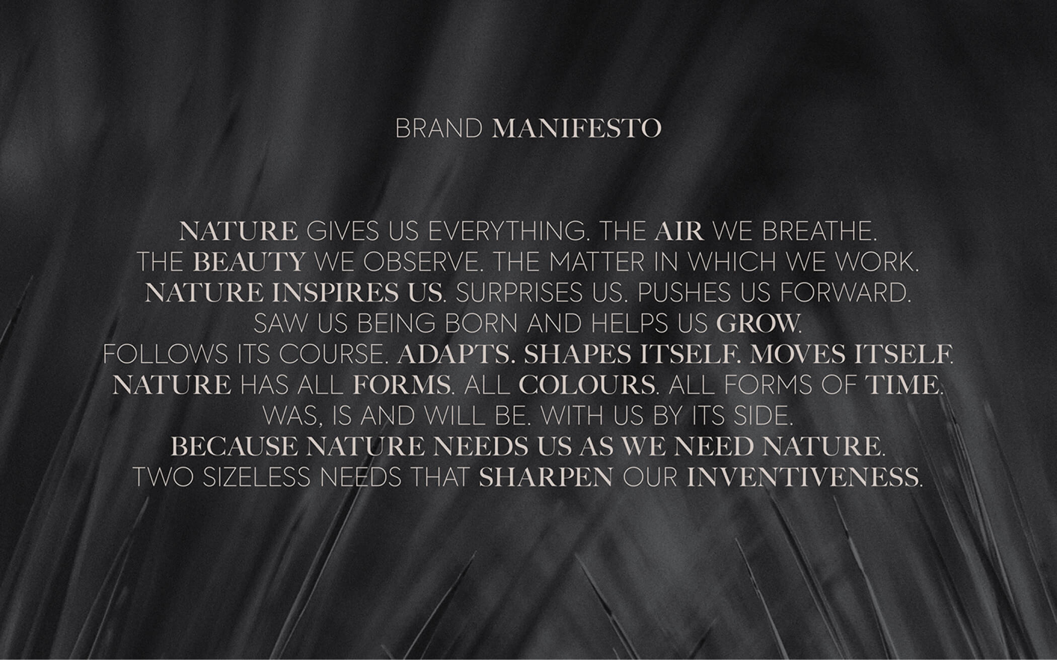
ODUM is a company that is active in the sector of modular houses, wooden constructions and other sustainable materials.
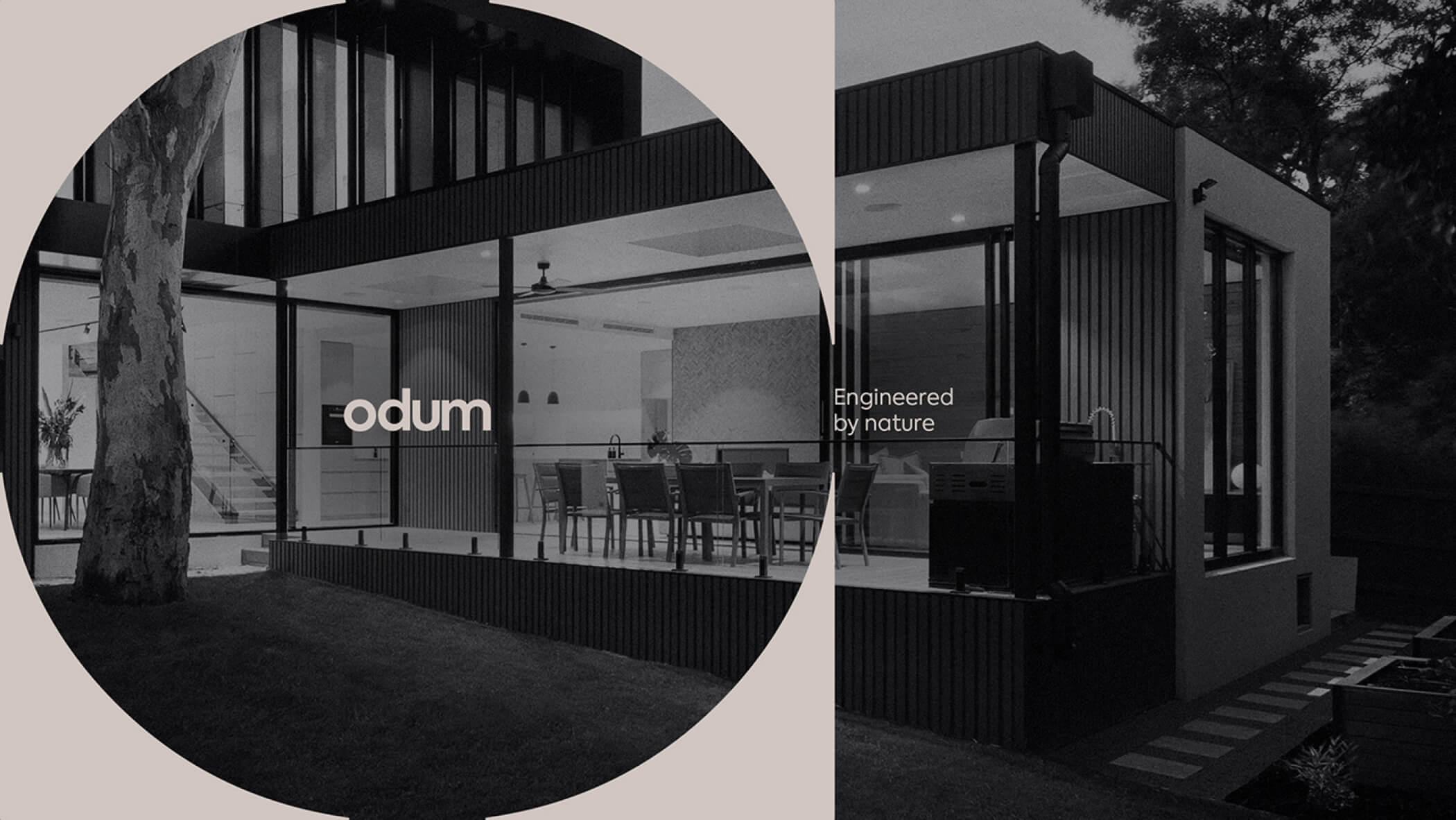
The brand is an expert. A trusted partner and a source of inspiration for anyone who is interested. Thorough, inspiring and progressive. A brand that combines the best of design and performance with the best for the planet.
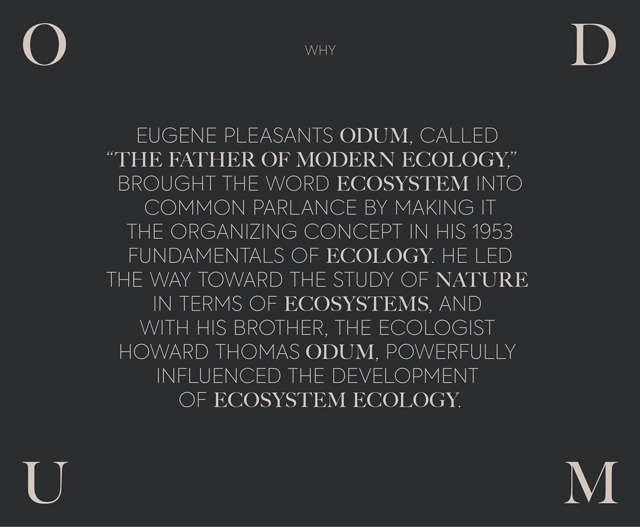
/ Challenge
To create a brand that stands out from the competition with a solid, rigorous and adjustable image, values inherent to the company. This brand will be mostly applied on sustainable materials or images that transport to that universe, so it should be able to stand out and have a personality in that kind of pieces and imagery.
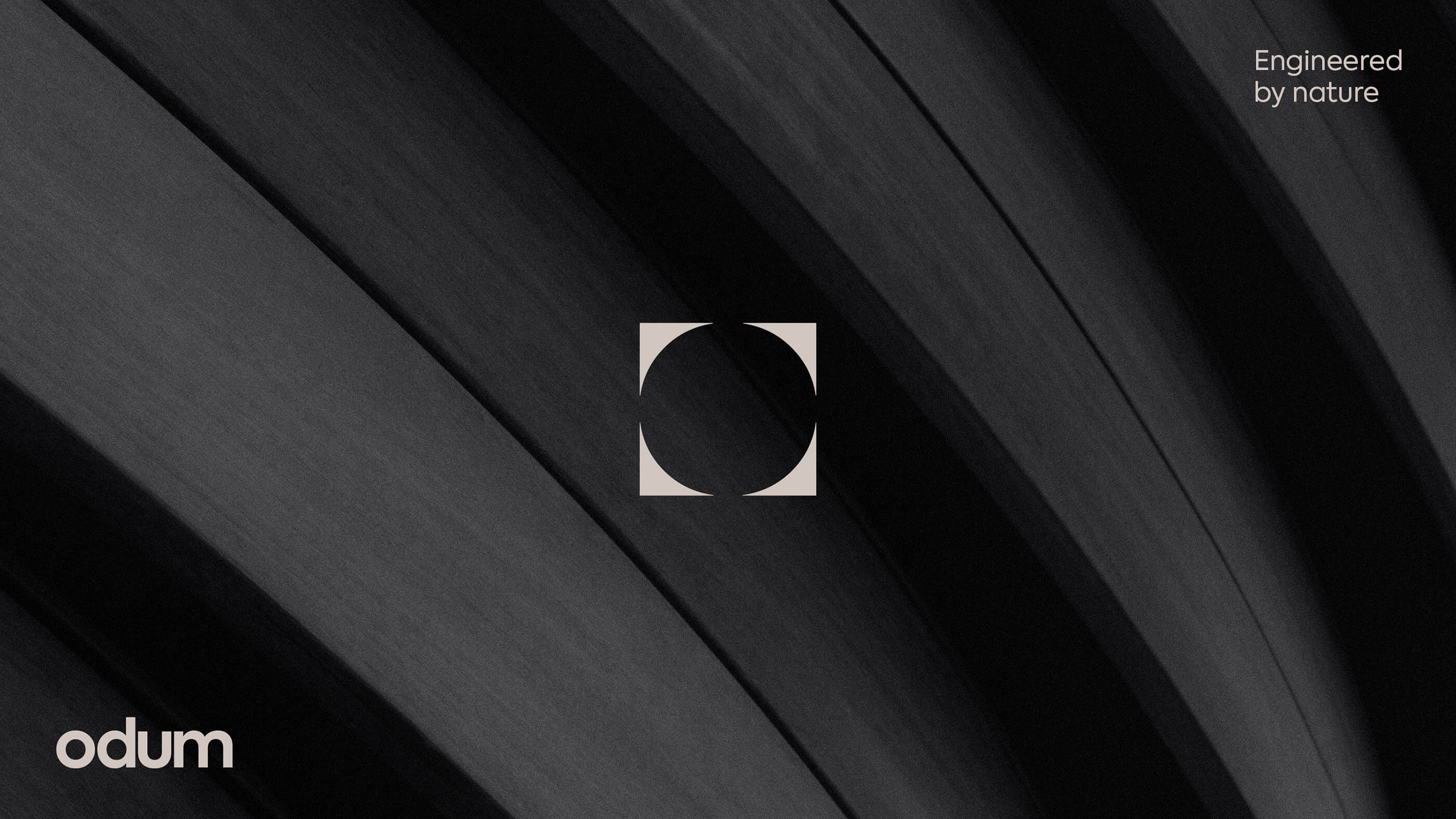
/ Idea
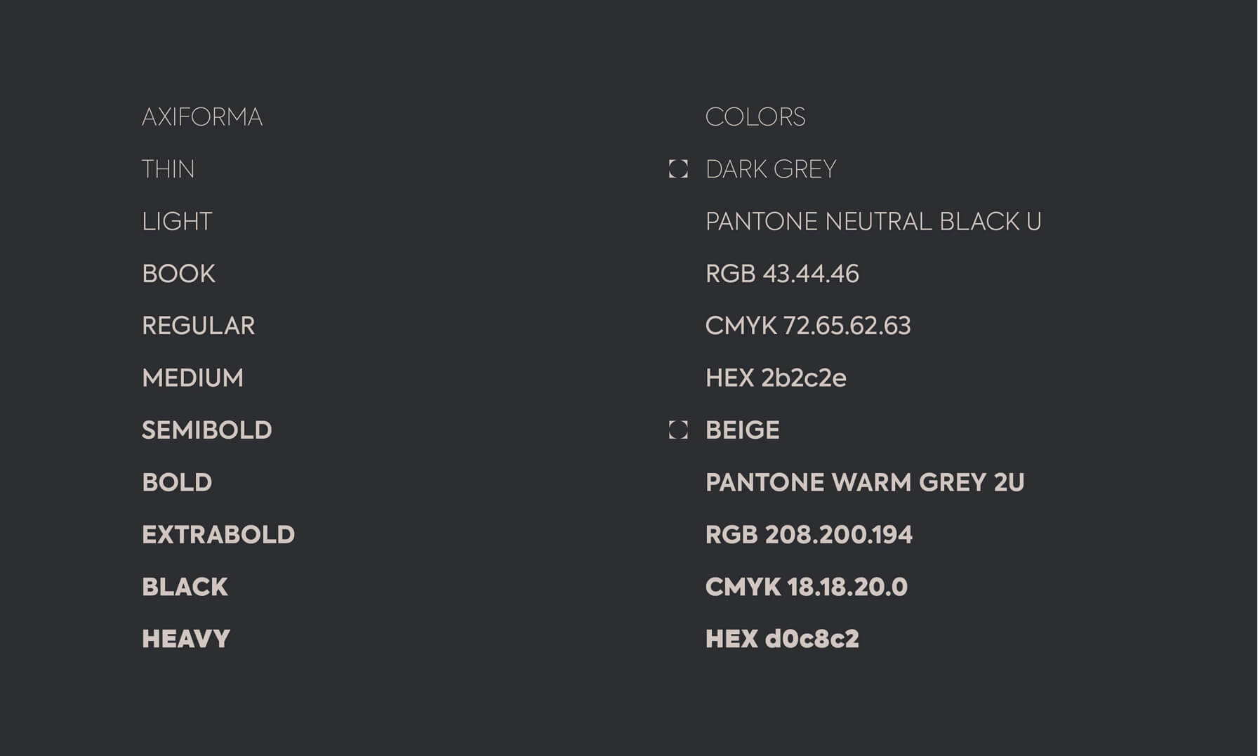
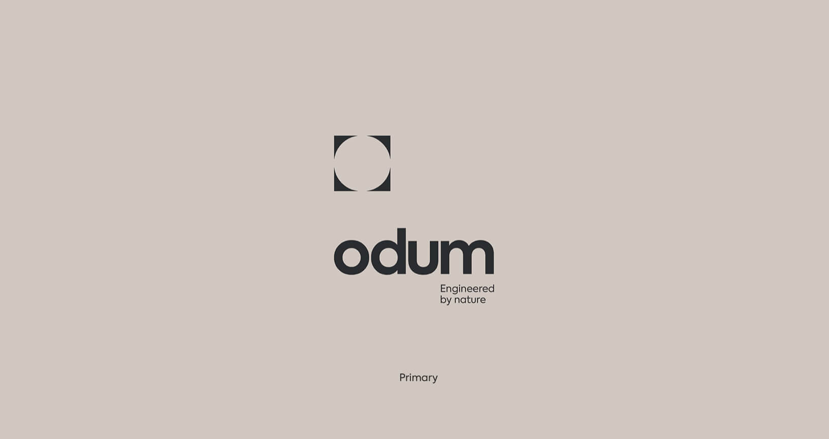
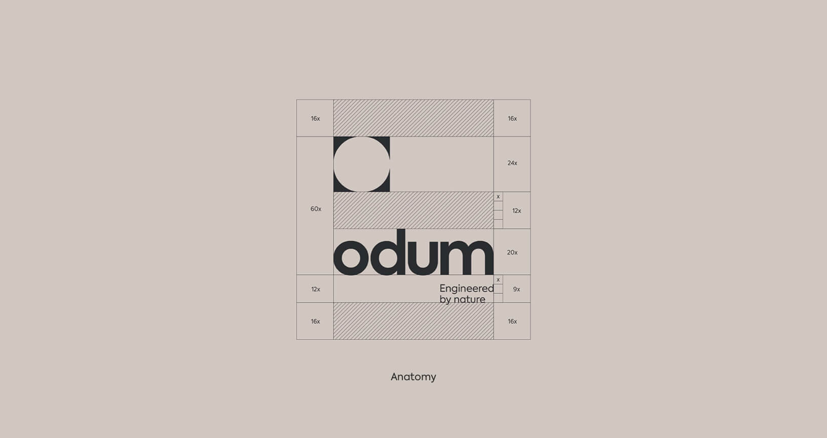
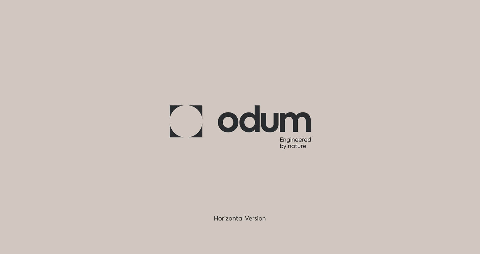
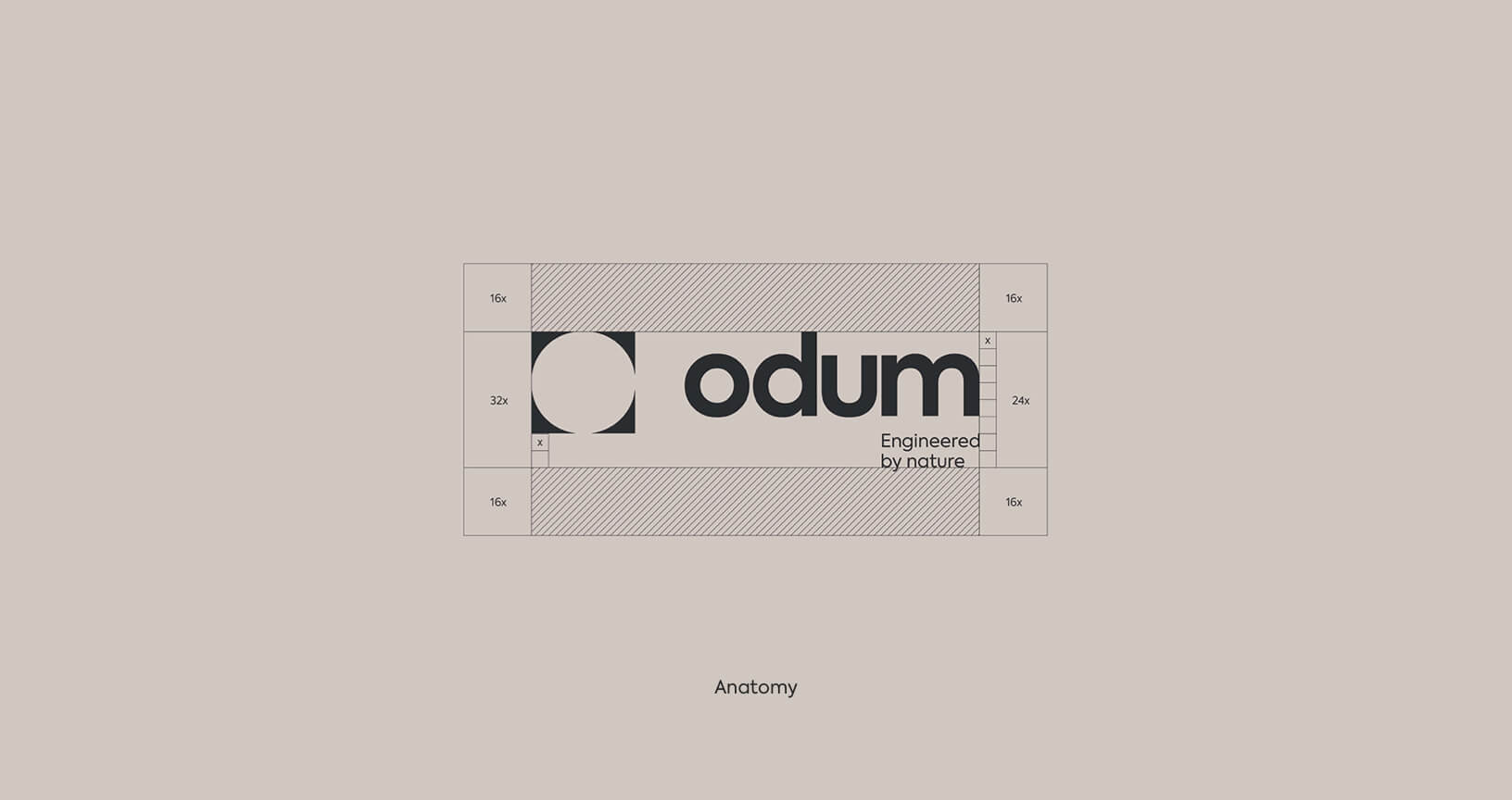
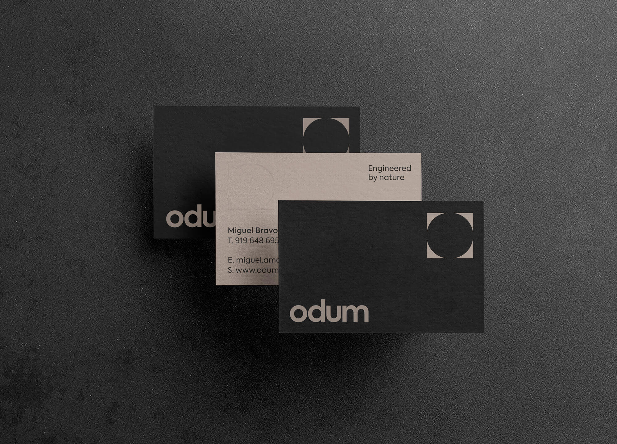
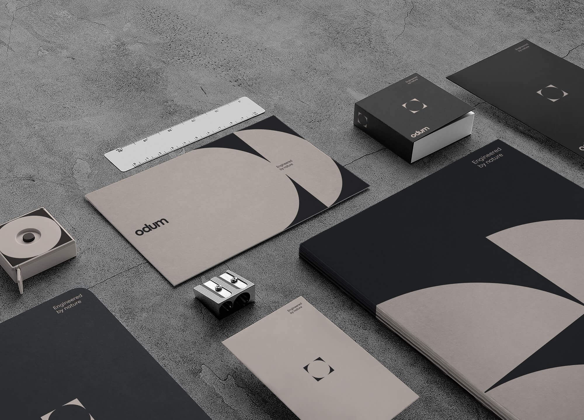
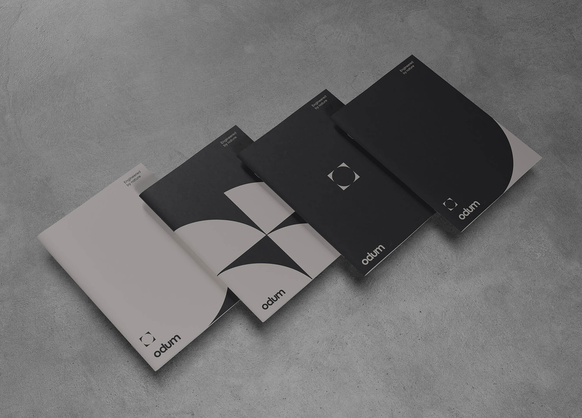
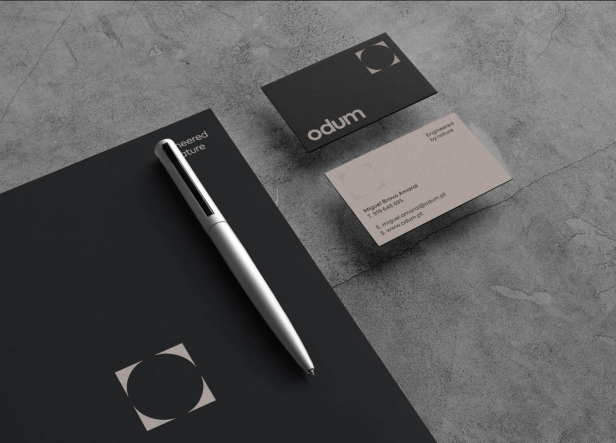
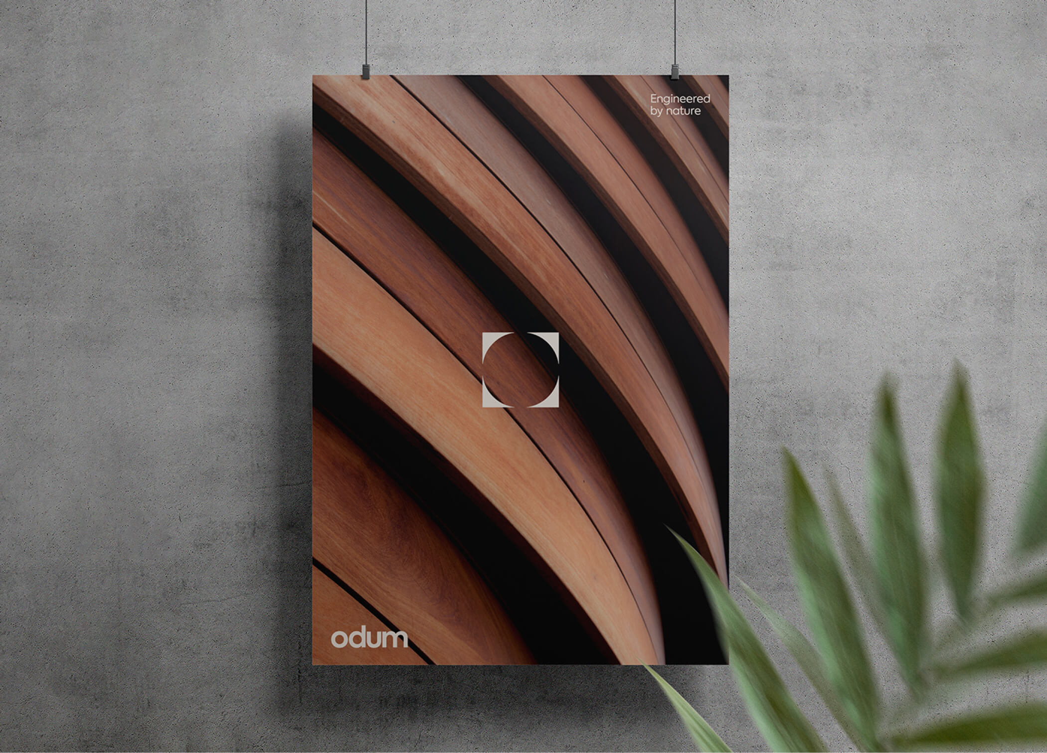
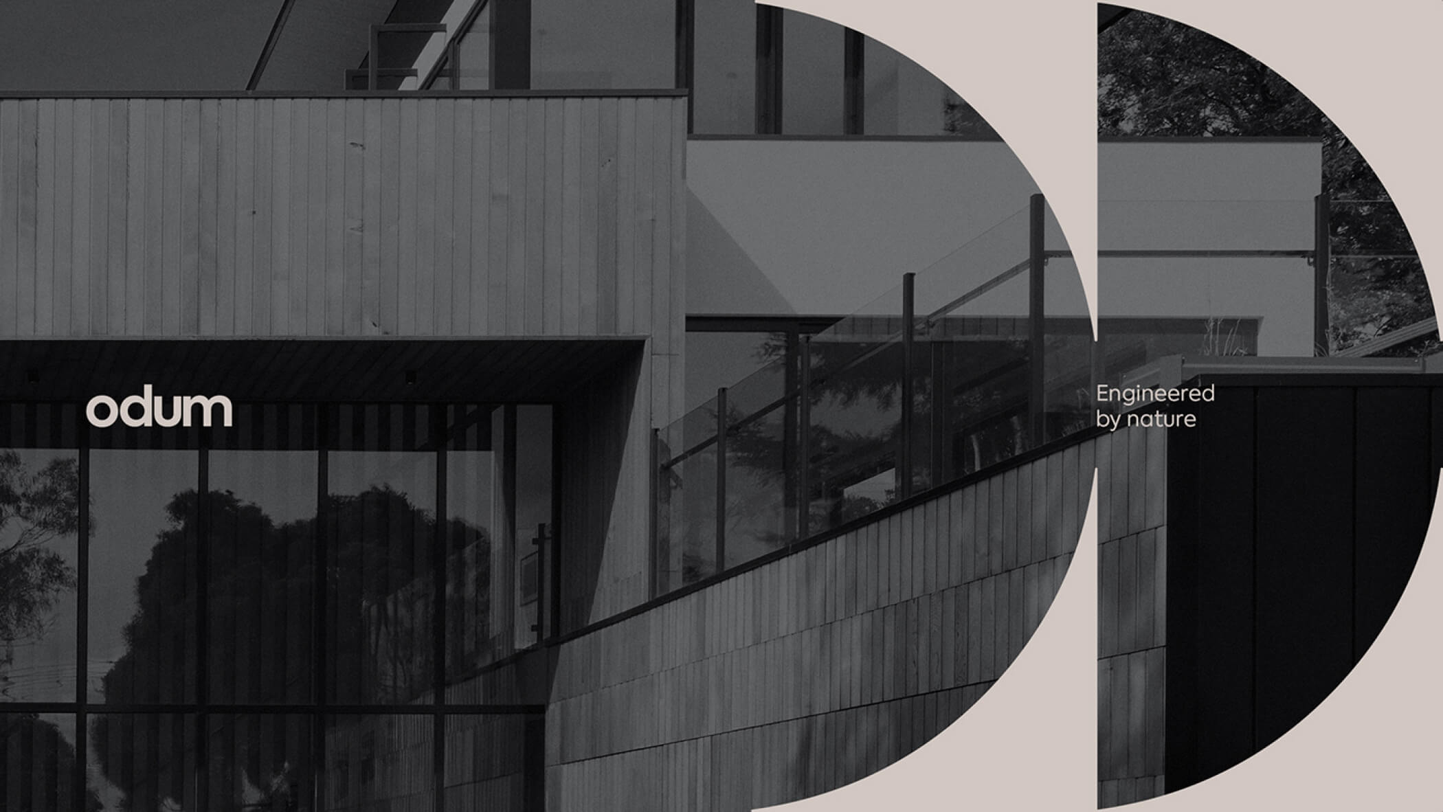
To achieve these positions and values, the attributes/elements of the logo include the use of a modern and sober typography, along with an icon that is based on the square shape, representing solidity. Through the integration of the letter "O" in the square, we achieved the extraction of 4 geometric shapes that have several representations: the "O" of ODUM, the square and the versatility of application in different supports and layouts.


/ Outcome
The result is a brand that is seemingly simple but full of meaning, solid and robust, but at the same time versatile and modular.