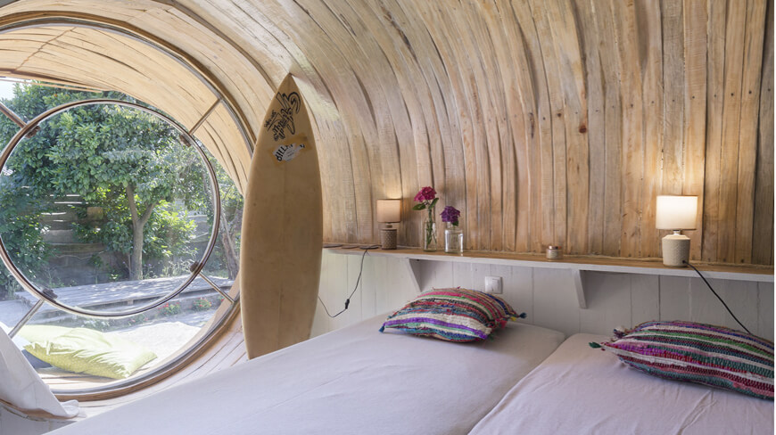
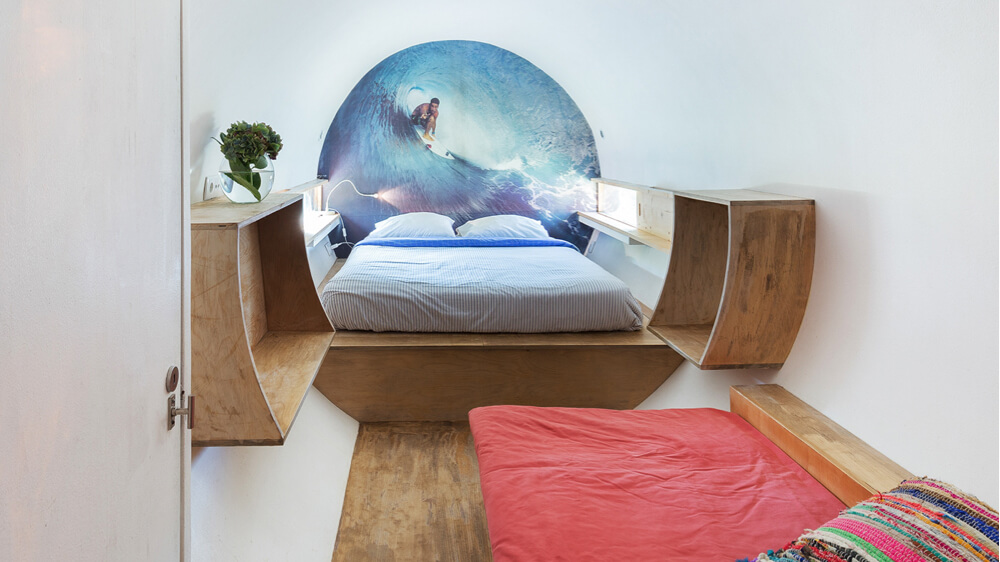
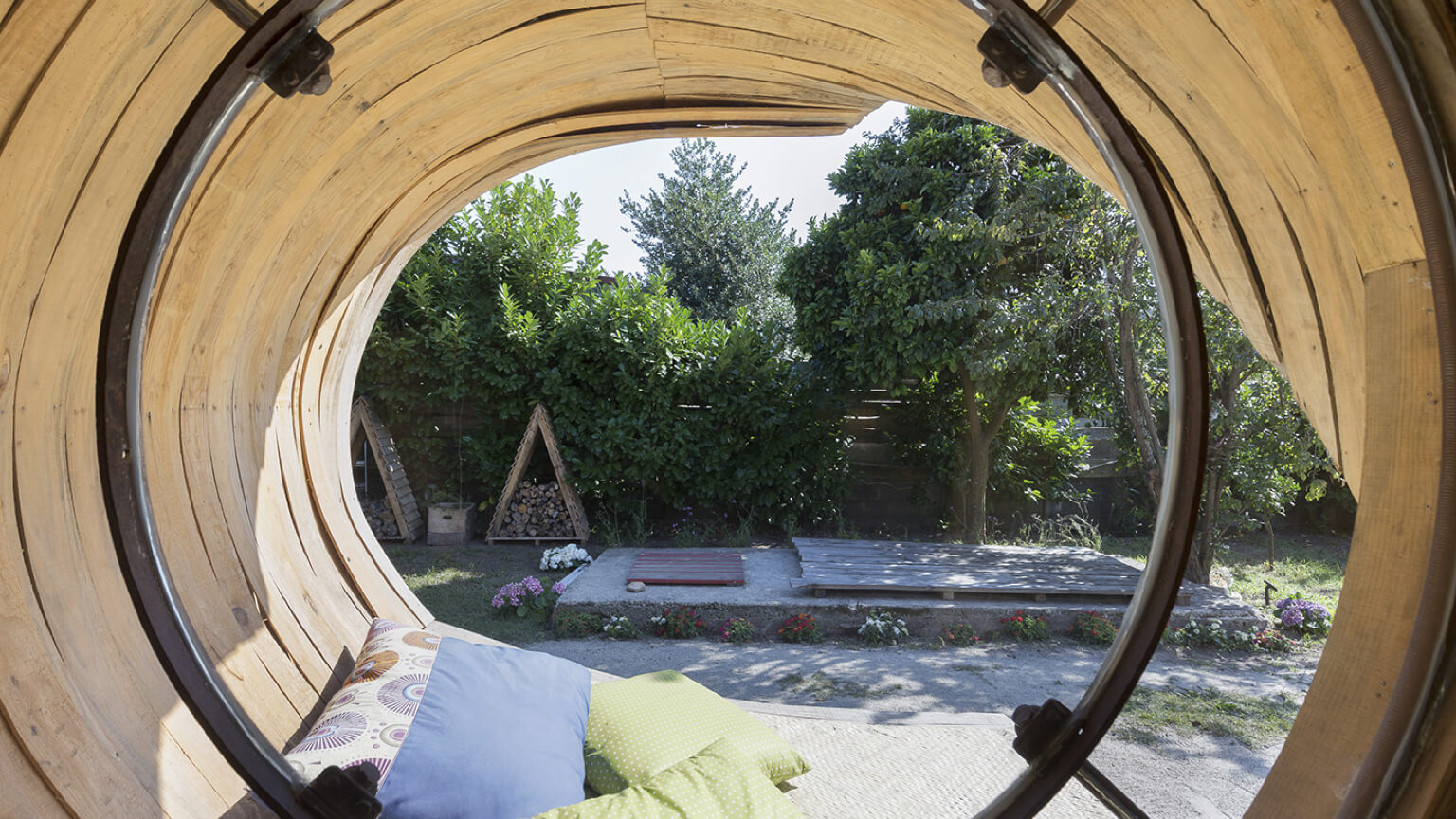
MacedaSurf Camp
/ Context
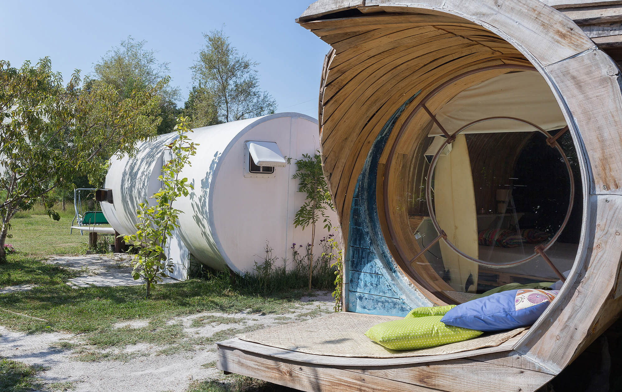
With a pleasent surronding area of pine forest, São Pedro da Maceda has a huge stretch of sand which allows you to choose the best location to surf. The combination of the forest park and the sea becomes a great option for those who like the countryside and beach.
/ Challenge
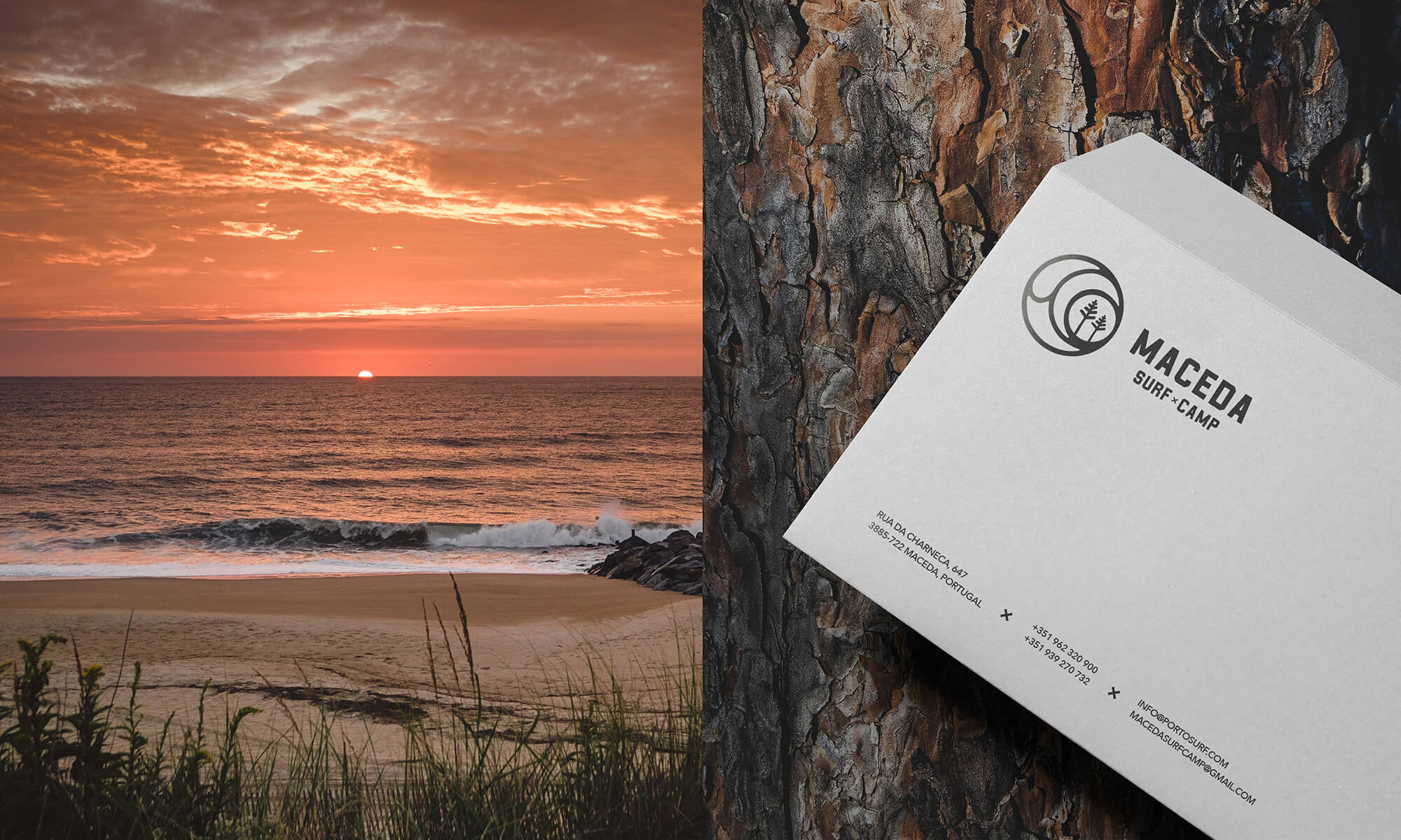
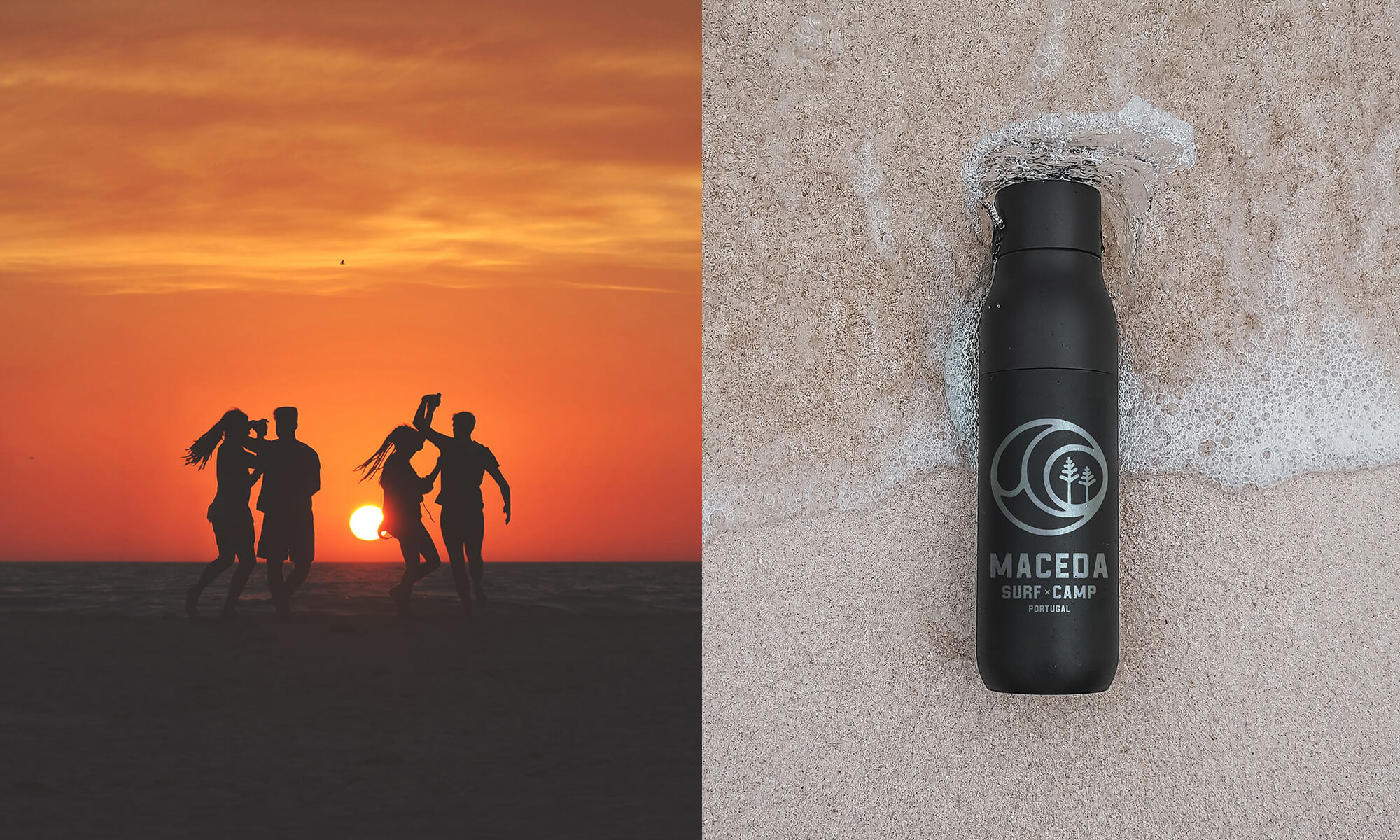
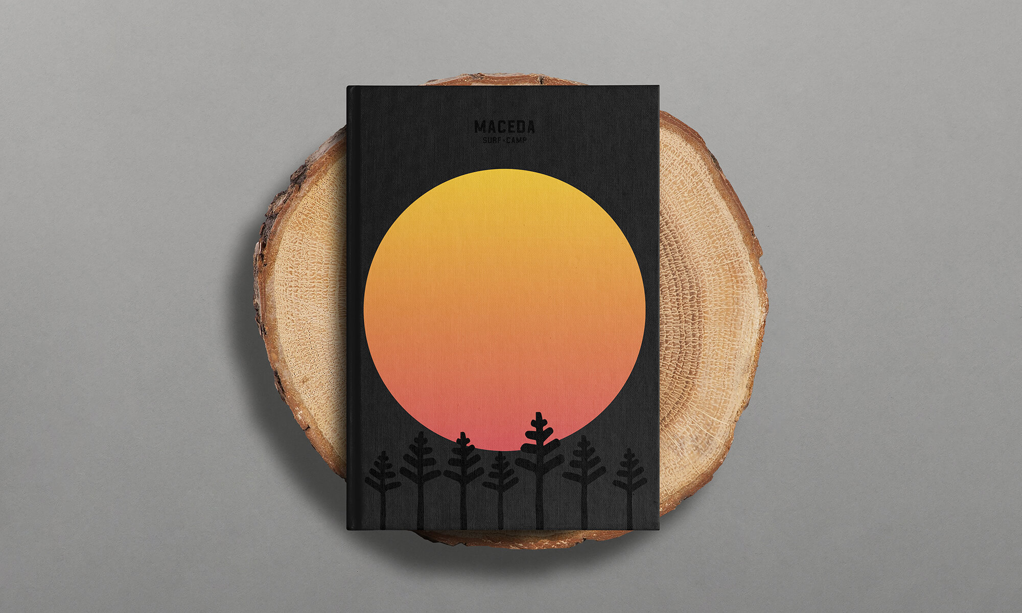
The challenge was made and the stakes were high - to create an identity for a Surf Camp that would reflect what is characteristic of Maceda, the place from where the company develops its activity and that, at the same time, reforged the core of the business. From these points, a brand was created in a harmonious way with the three elements that contribute to the beauty of this place: the sea, the pine forest and the sunsets with warm and unique colors.
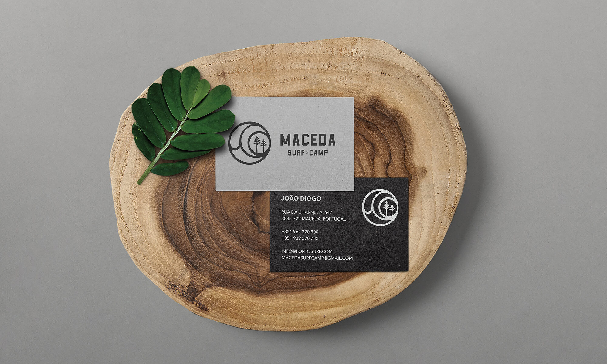
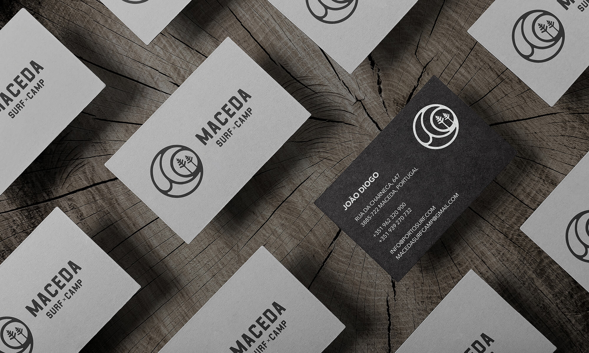
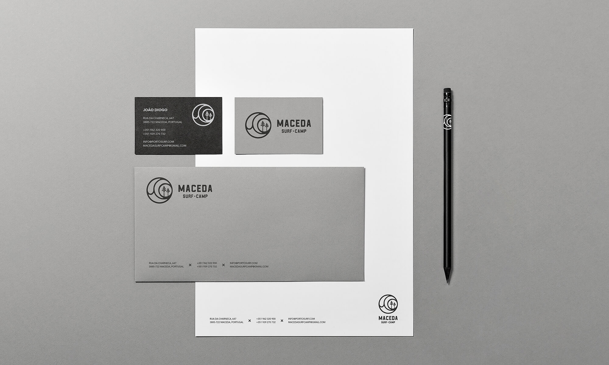
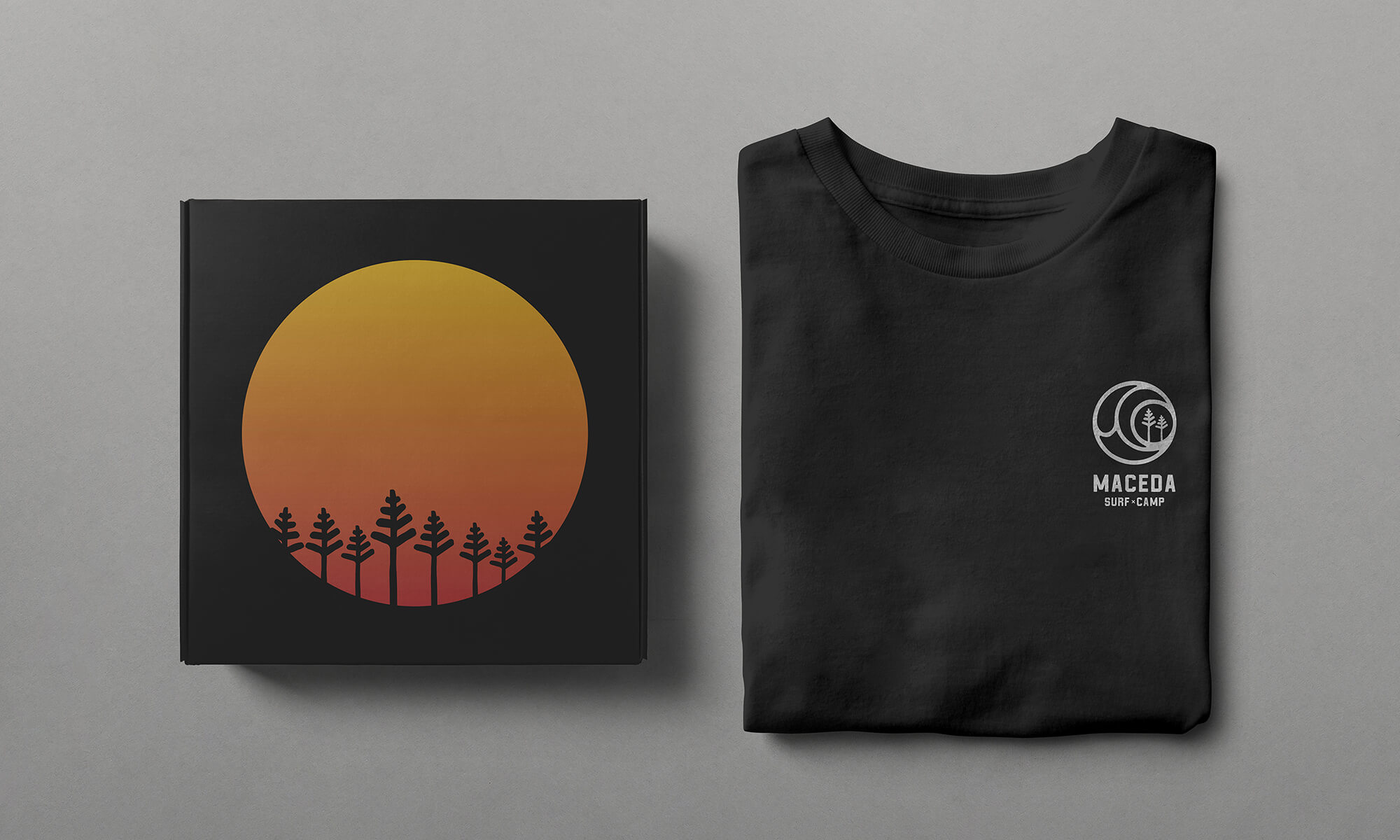
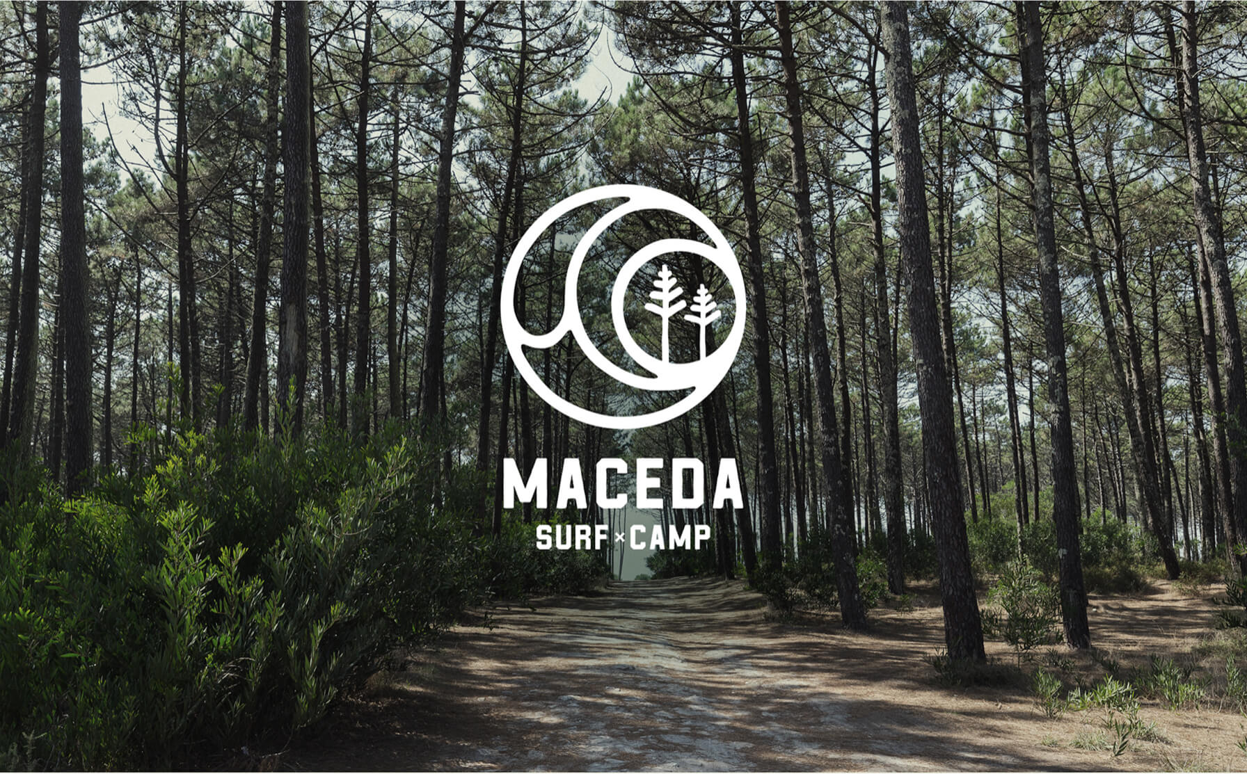
/ DESIGN IDENTITY
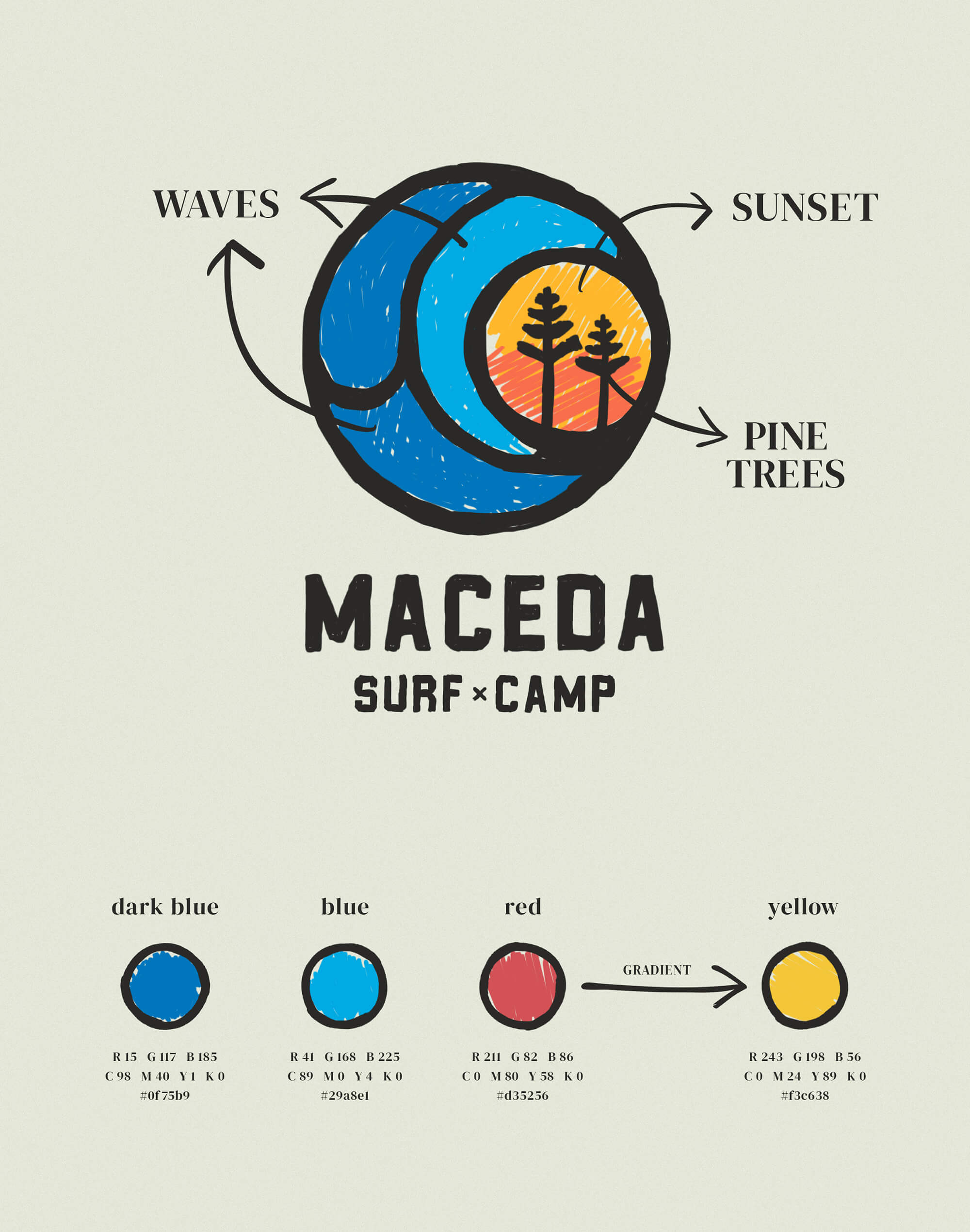
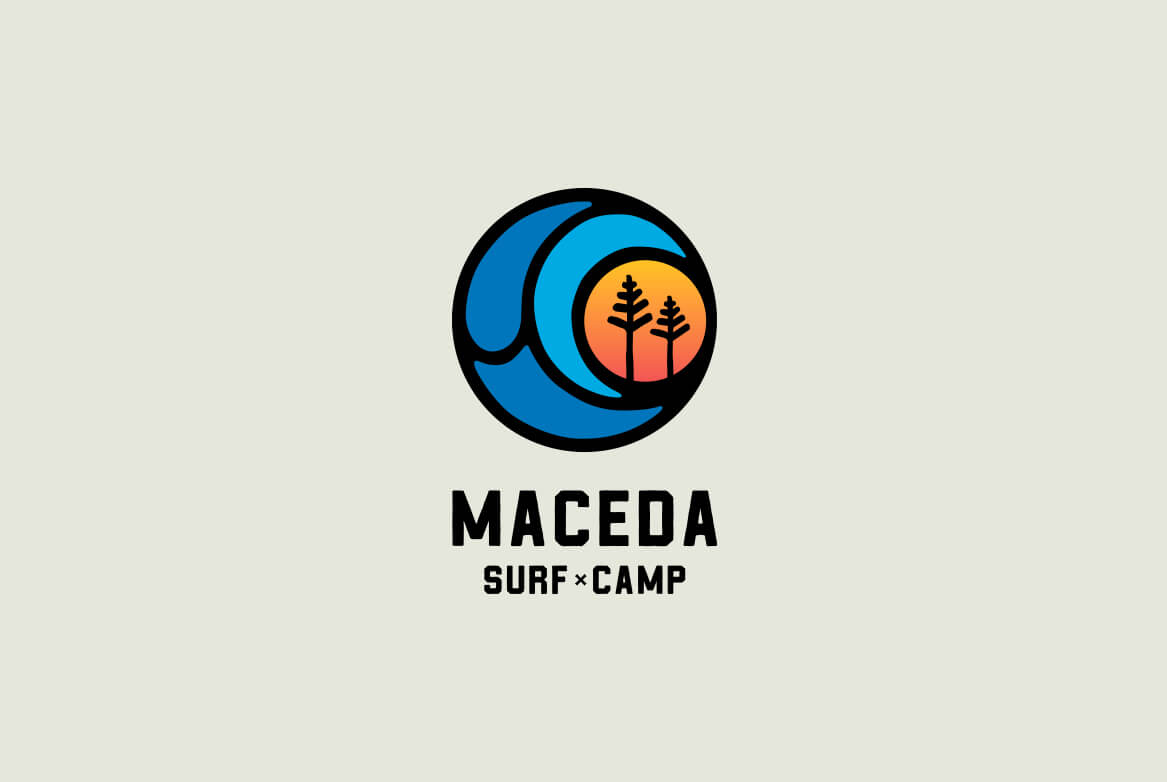
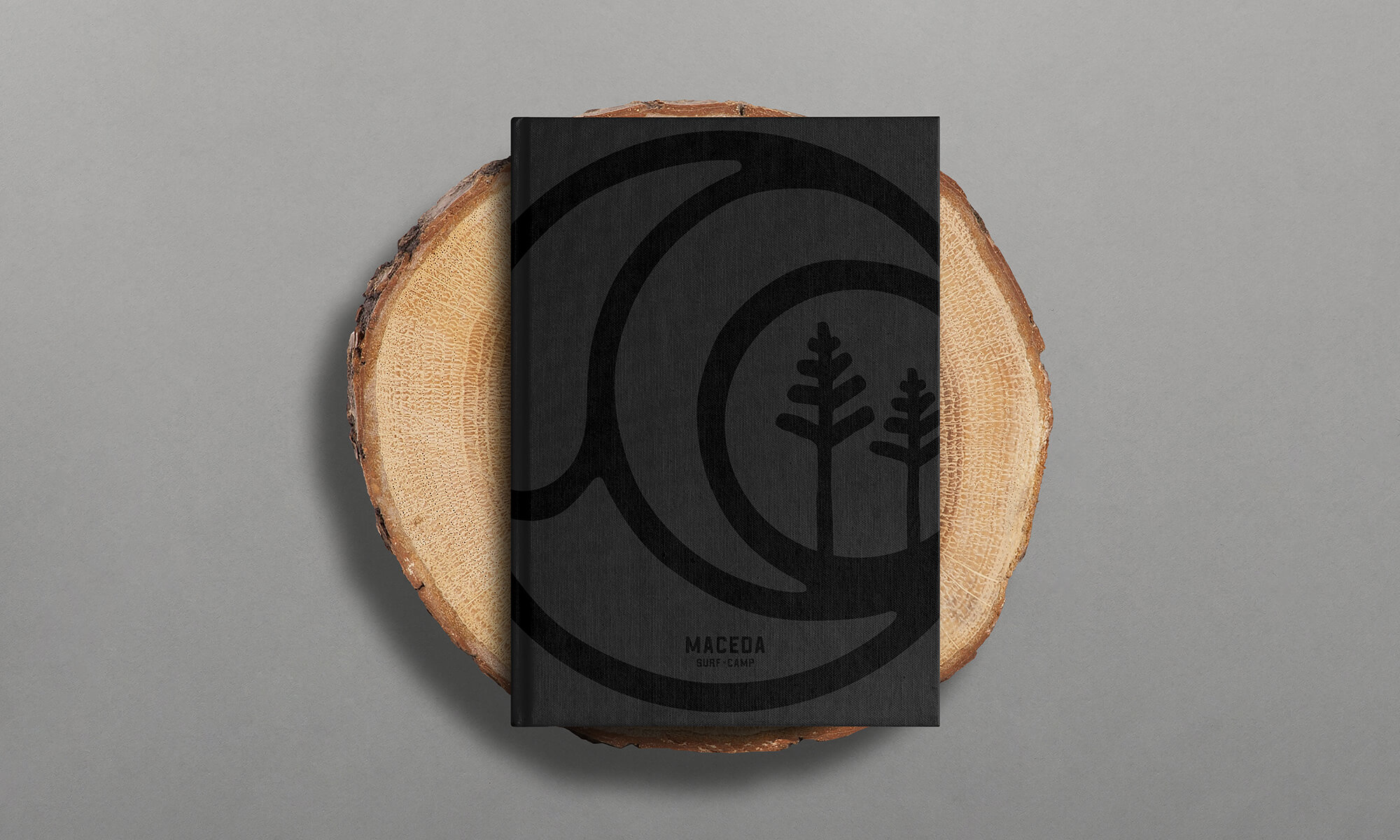
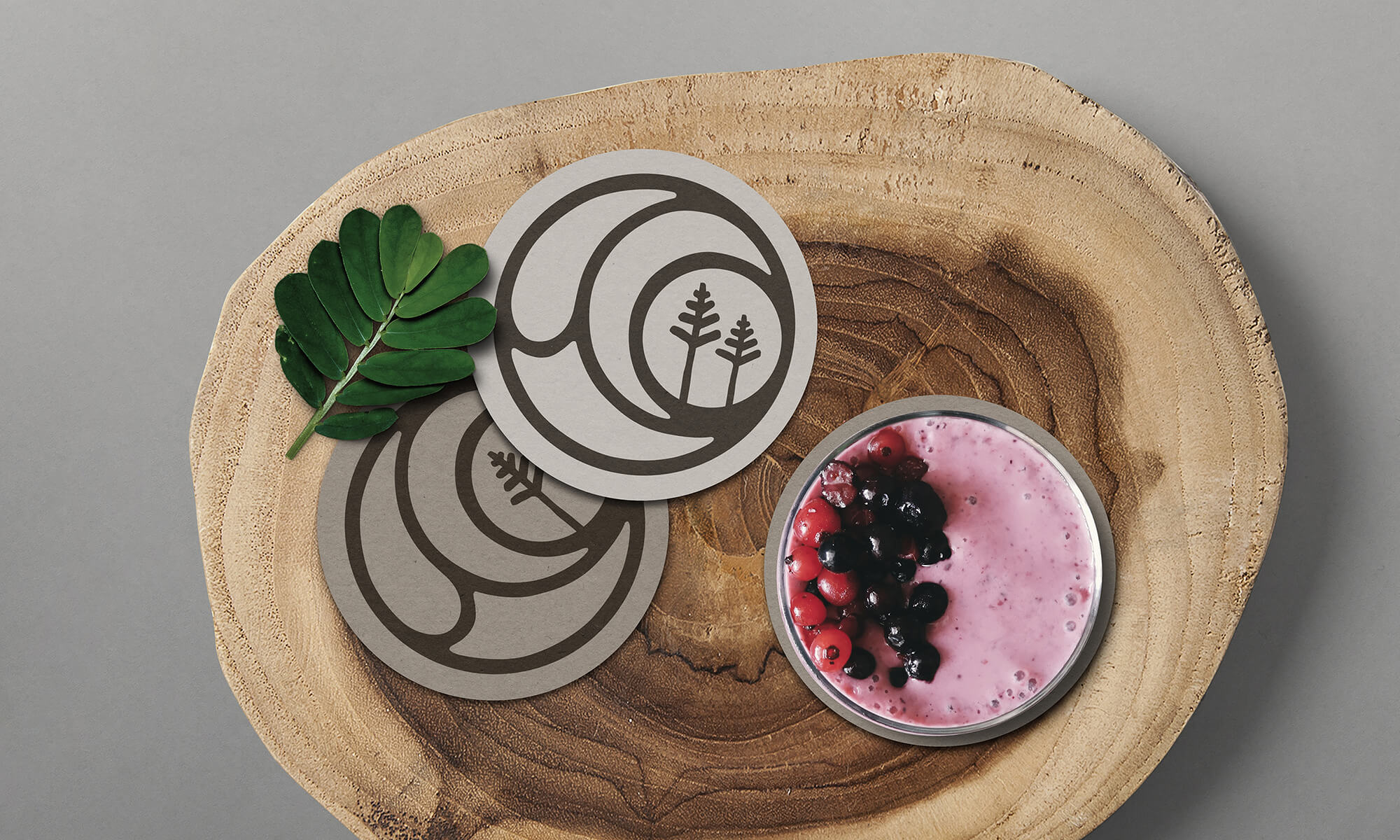
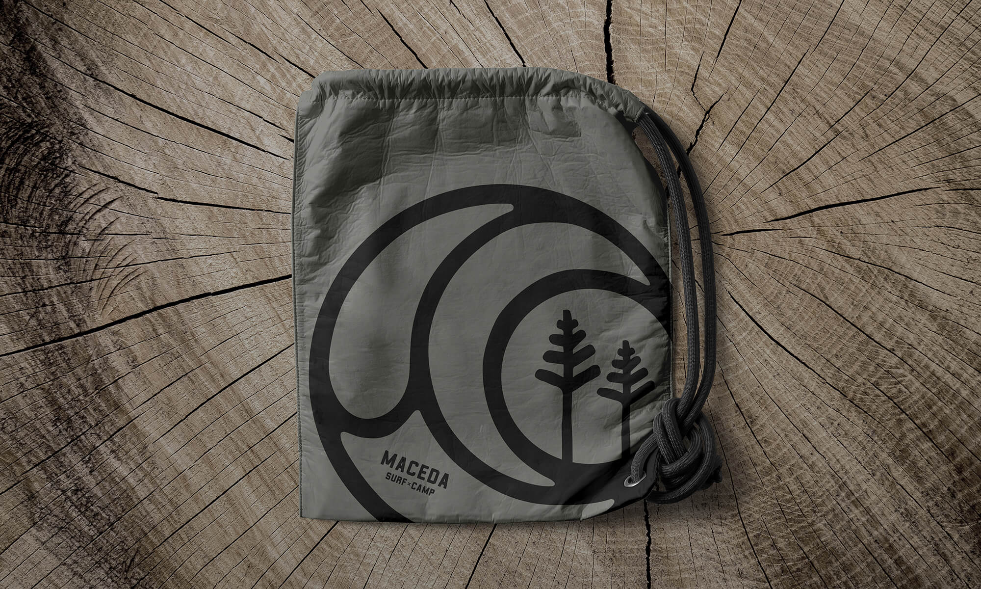
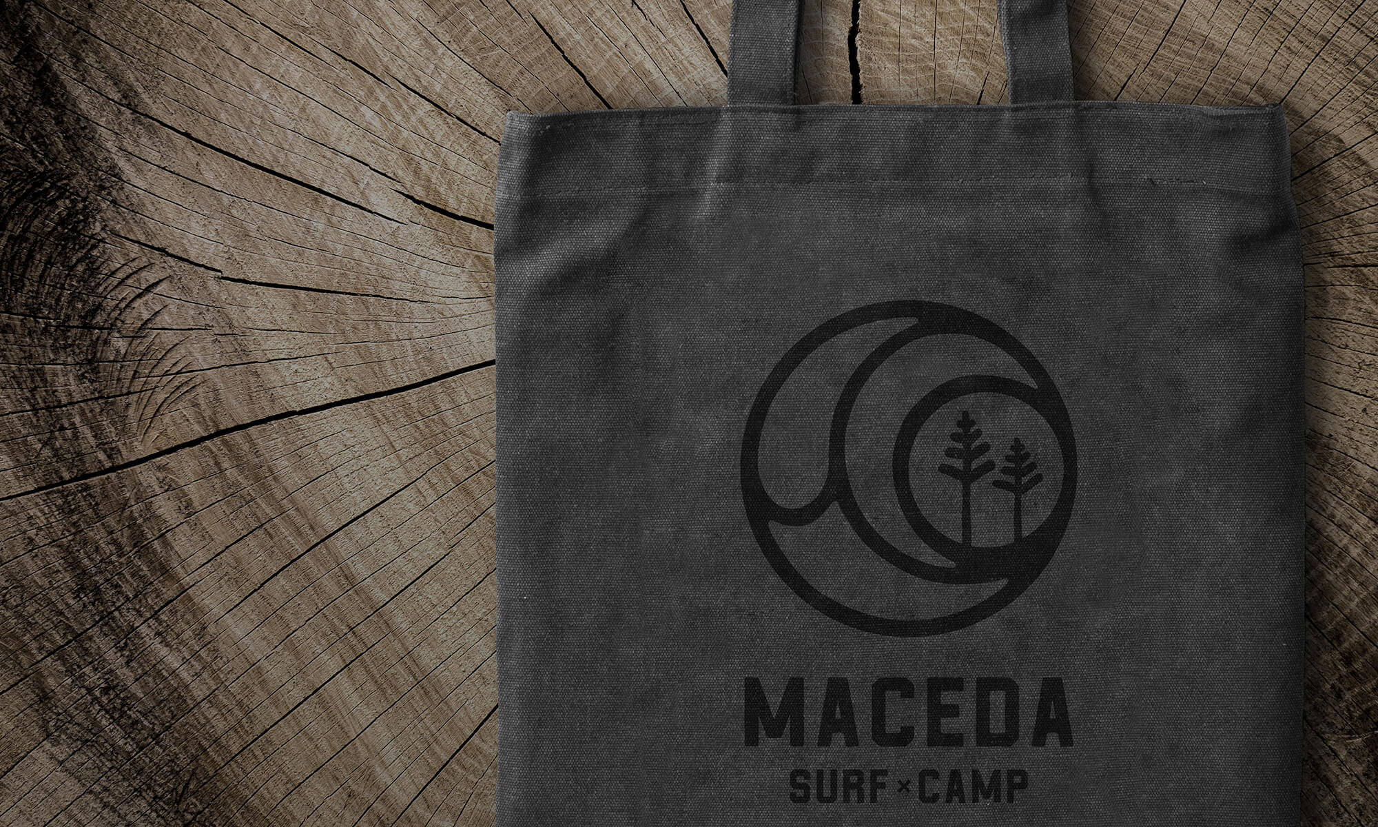
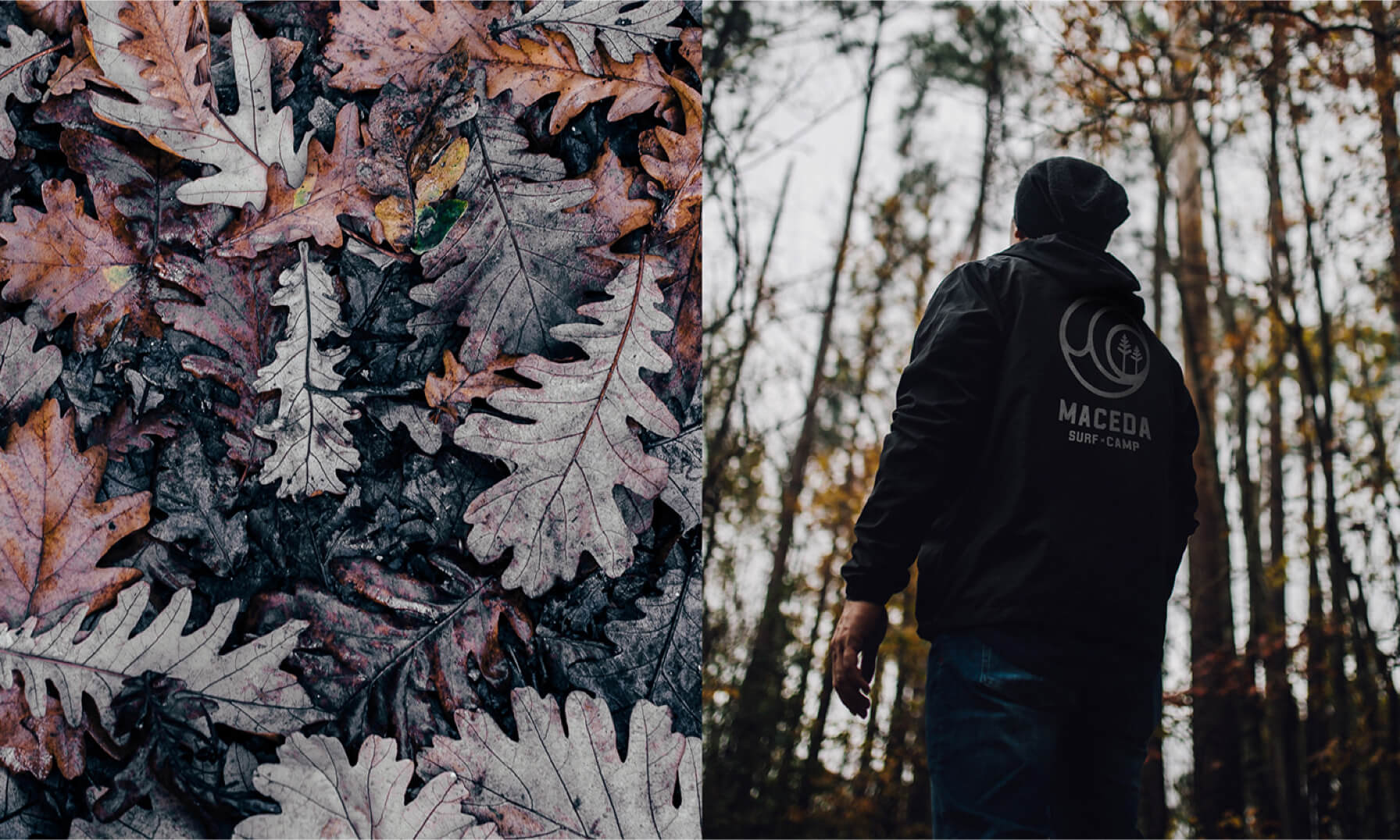
From circular eccentric shapes, we represent the three elements that characterize the place: the waves, the pine forest and the sunset. These representations make this a unique and memorable symbol with an easy perception and comprehension. The shapes are of an easy application/use at the various channels and stand where the brand operates. The typography has a craft, casual and strong look, that reinforces, even more, the cool and handcrafted side present all around the Surf Camp.

/ Outcome
Throughout the creation process there was a constant concern so everything would result in a fresh and fun image, because that’s Maceda Surf Camp DNA.